Aplus Servis is a breathing air systems service company based in Ankara: SCBA and EEBD maintenance and testing, breathing air testing, gas detector calibration and field service. It is the service company of Aplus Engineering, the same family as Aplus TTM, whose brand identity and website we designed earlier.
What a service company needs from day one is for every document it produces, in the field and at the office, to carry the same identity. Service reports, calibration certificates, quotes and device labels reach the customer's hands far more often than any advertising. Aplus Servis wanted to set out with a logo of its own and an identity system that brings these documents into one language. The same language had to carry over to its website.
The process started with a logo presentation of three concepts and one bonus approach. Building on the chosen concept, we designed the logo and logo system, the brand guidelines, the social media profile images, a print set that runs from letterhead to device labels, and the Word templates filled in at the office. We delivered the set as PDF-CMYK and EPS for the print shop, and as Word and PDF for the office. We then designed, built and launched a 19-page website with the same identity.
A service company's brand meets its customers mostly through documents. When we reviewed the workflow of Aplus Servis, four document types produced regularly in the field and at the office stood out:
These documents are sometimes filled in by hand, sometimes printed at a print shop, sometimes produced from Word at the office. The identity had to look the same in all three uses. This analysis is why we designed a form system from scratch alongside the logo.
The logo work began in August 2026 with a presentation prepared exclusively for the management of Aplus Servis. It featured three concepts and one bonus approach. Judging a service logo on looks alone is not enough, so we compared all of them against the same four criteria:
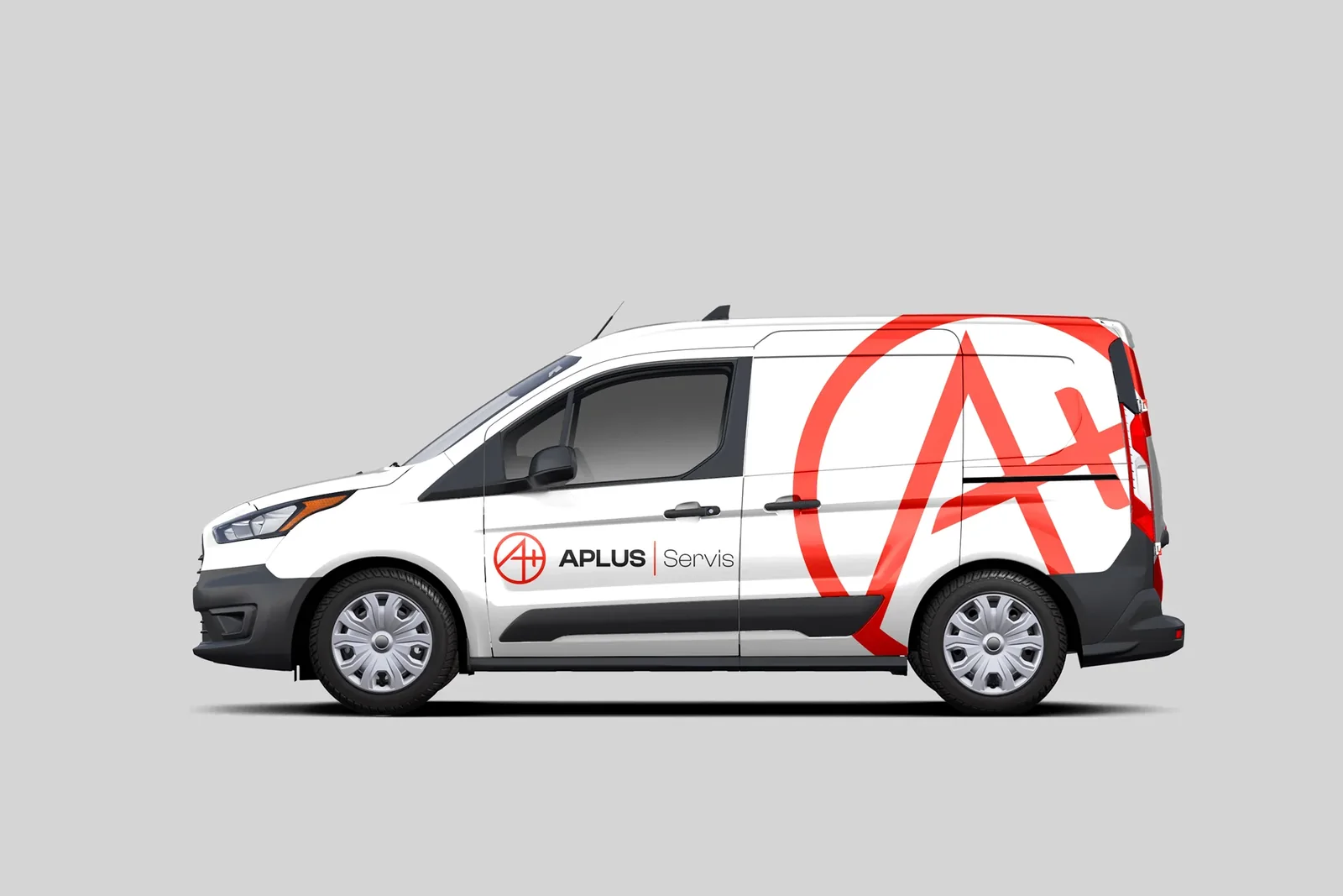
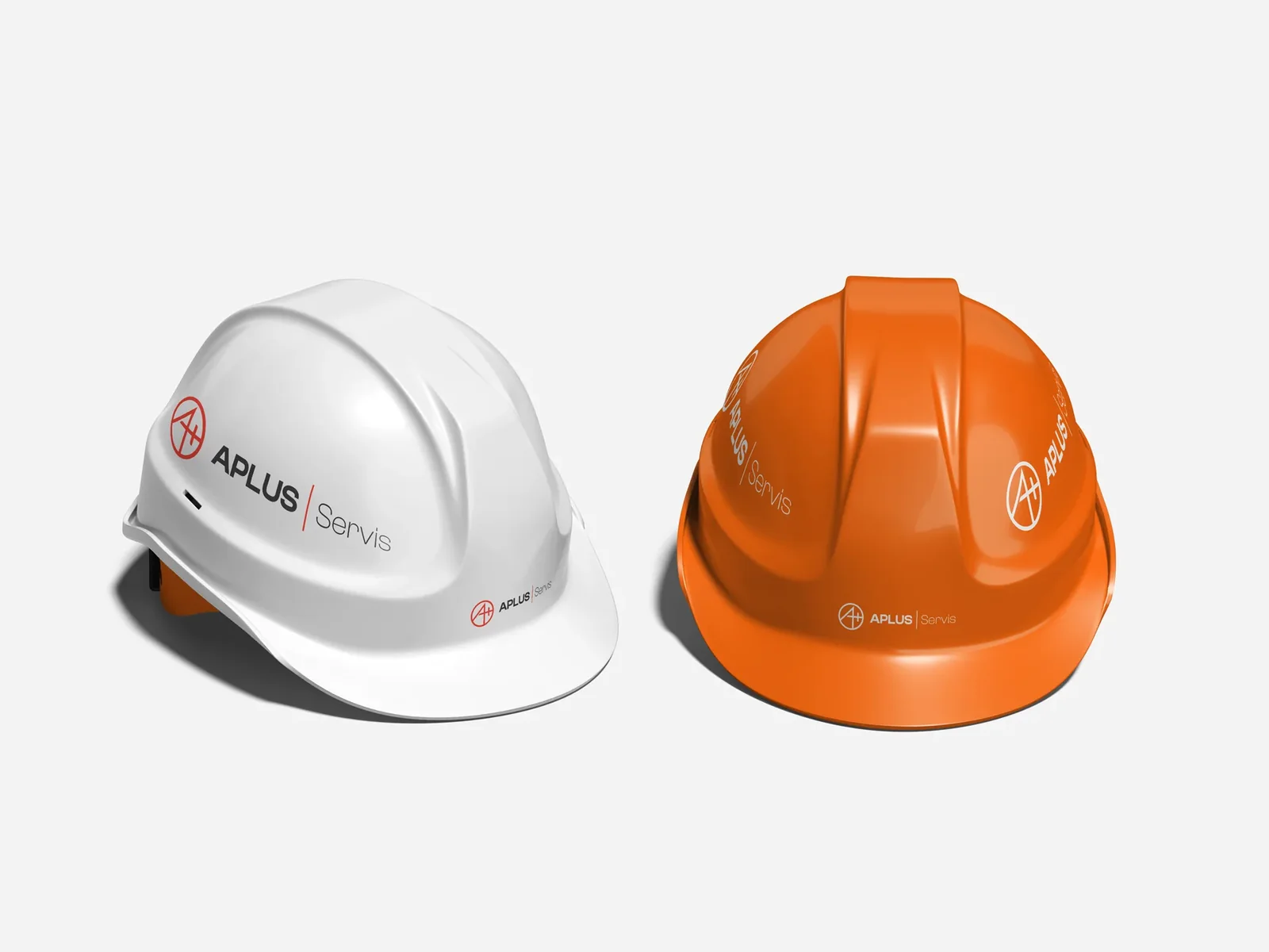
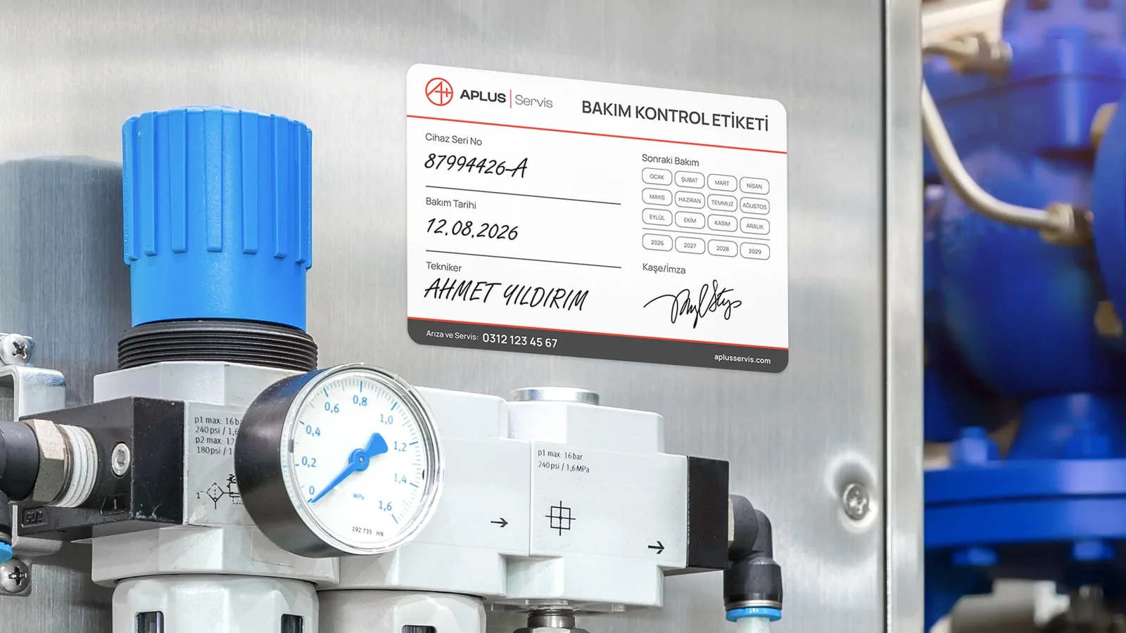
We showed every concept on a service van, hard hats, a safety vest, a maintenance label on a machine and as an embossed print. The chosen concept was Pergel, Turkish for compass: an engineer's compass and the A+ grade meet in a single symbol. The compass stands for precise measurement and technical accuracy, the A+ for a high quality standard.
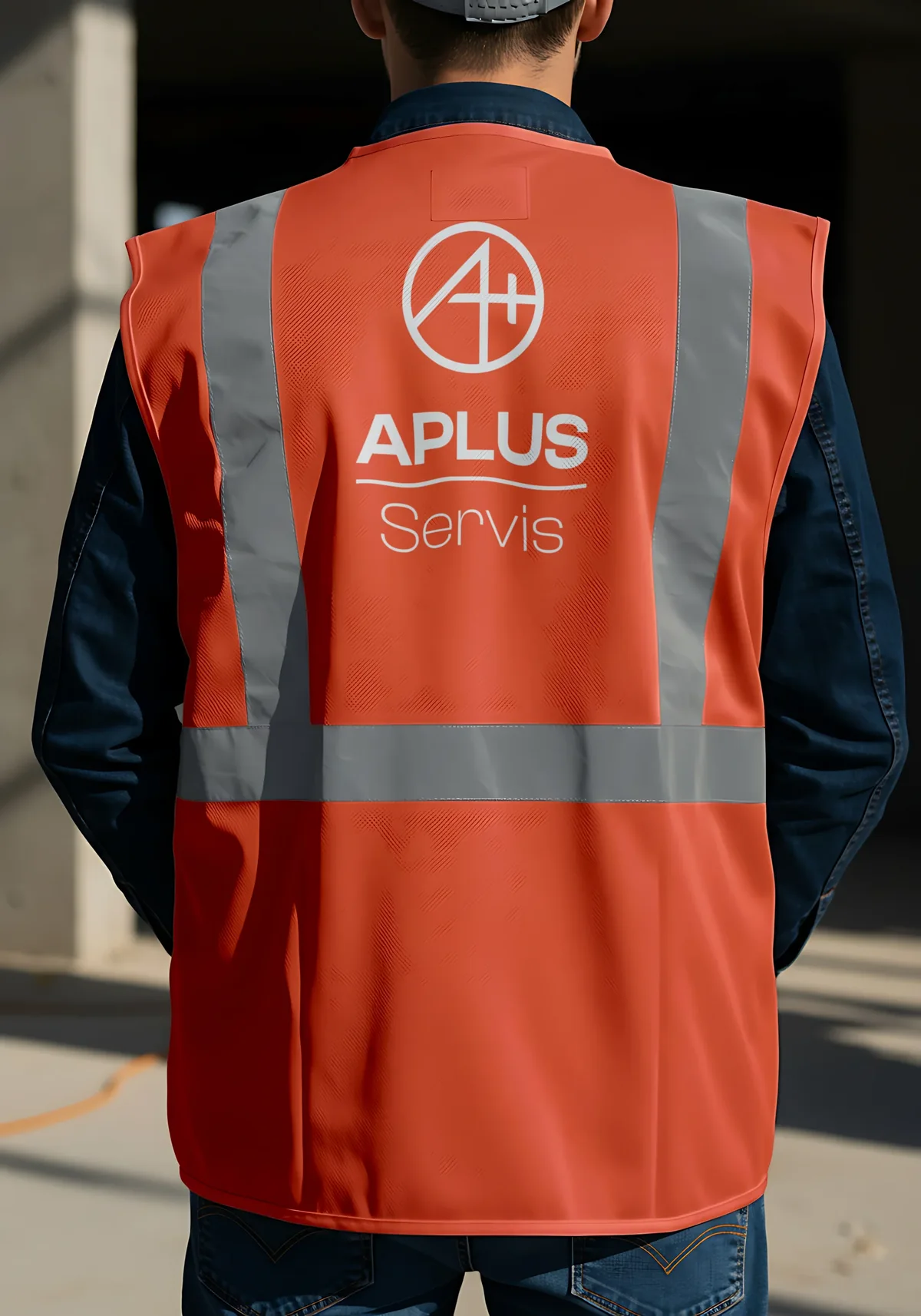
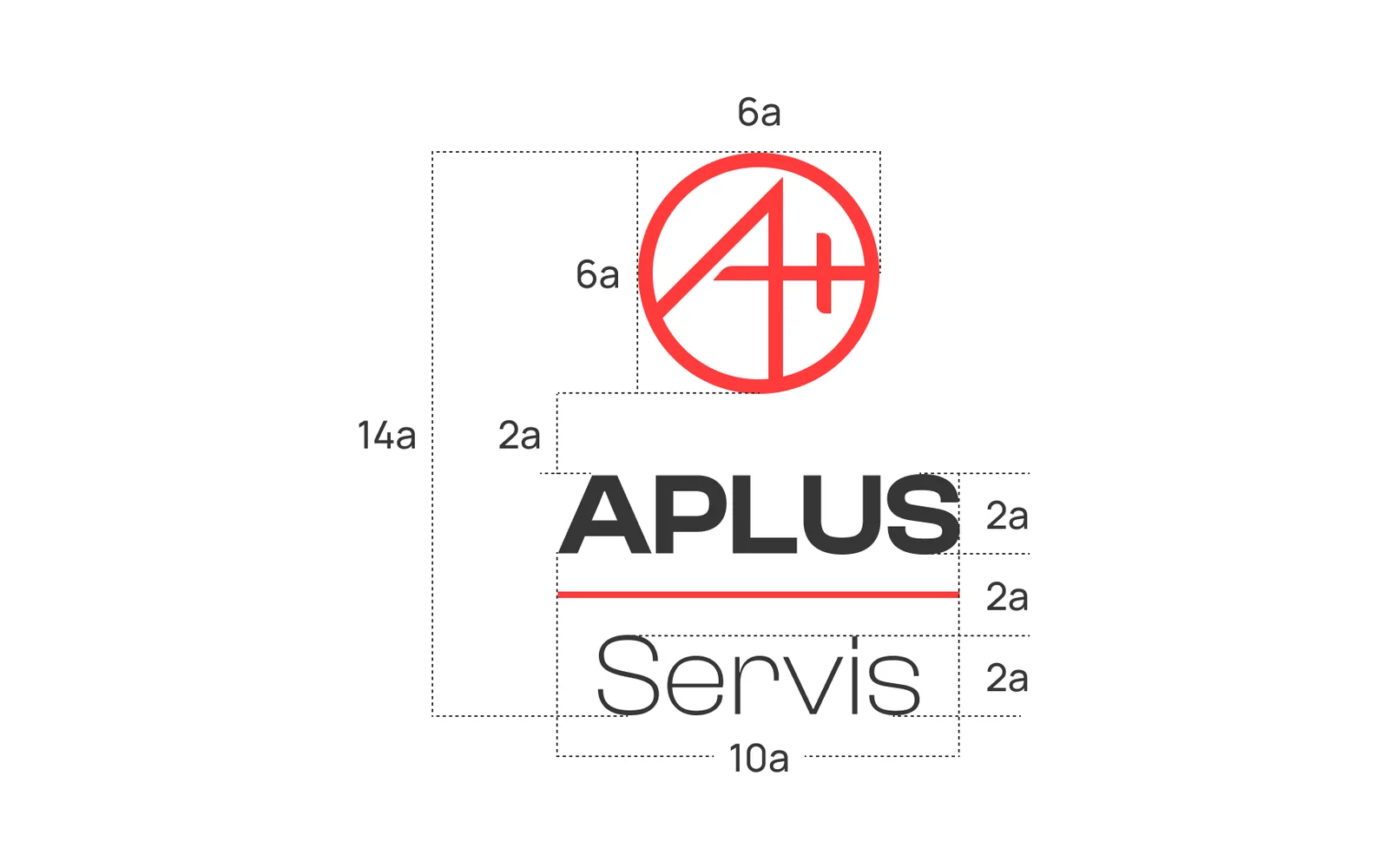
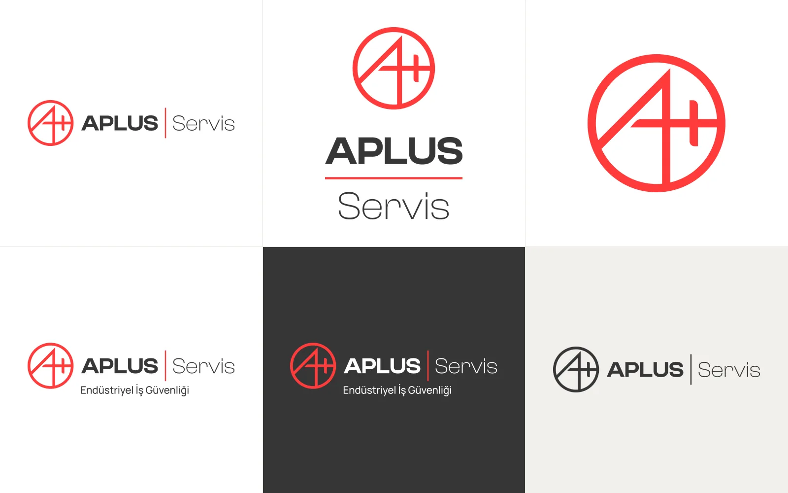
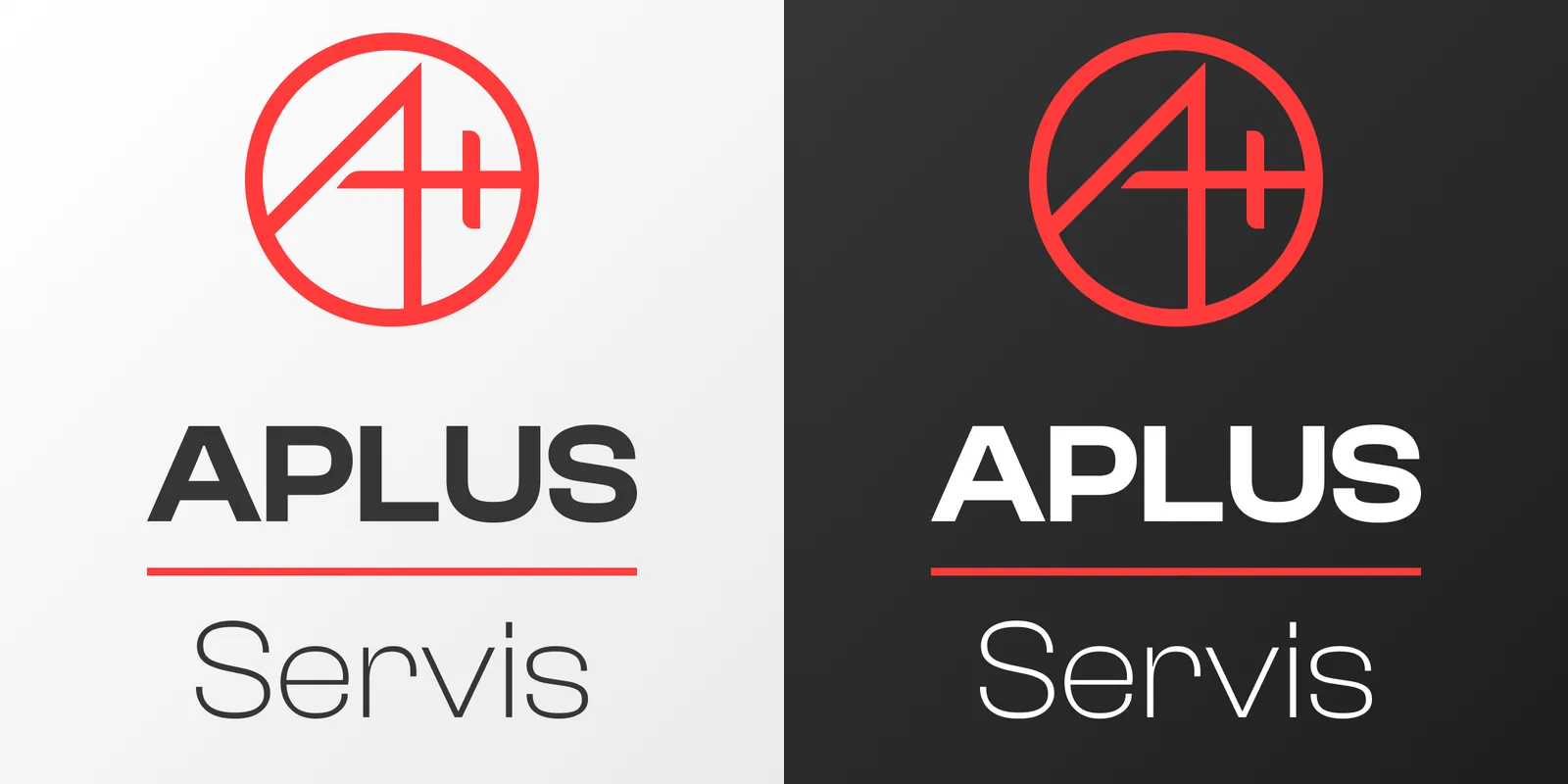
The logo is a letter A and a plus sign set inside a red circle. The slanted leg of the A cuts through the lower left edge of the circle and joins the ring, while its upright leg is shared with the stem of the plus. The horizontal stroke serves as both the crossbar of the A and the arm of the plus, so the A and the plus are tied together in a single line system.
The logo's proportions are defined by a unit, a. In the vertical lockup the icon is 6a wide, the wordmark block is 10a wide, and there is a 2a gap between the icon and the wordmark. All measurements of the horizontal and vertical lockups are set out in the brand guidelines.
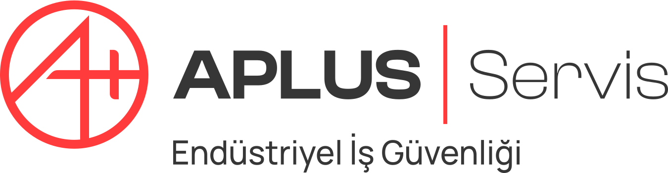
In the wordmark, APLUS is set in a bold weight and Servis in a light one, separated by a red vertical rule. Aplus reads as the shared roof of the family, Servis as this company's line of work. In the tagline version, the words "Endüstriyel İş Güvenliği" (Industrial Safety) sit beneath the logo.
The color palette was reduced to two colors: red #FF3B3B and dark gray #363636. Clash Display is used in the wordmark, Manrope in documents and all running text.
Wordmark and web headings
AaBbCcDdEeFfGgHhIiJj KkLlMmNnOoPpQqRrSsTt UuVvWwXxYyZz 0123456789
AaBbDocuments and text
AaBbCcDdEeFfGgHhIiJj KkLlMmNnOoPpQqRrSsTt UuVvWwXxYyZz 0123456789
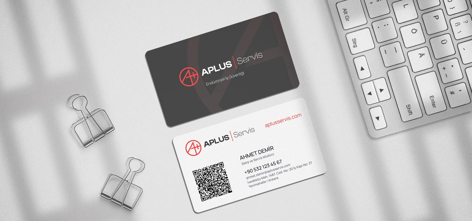
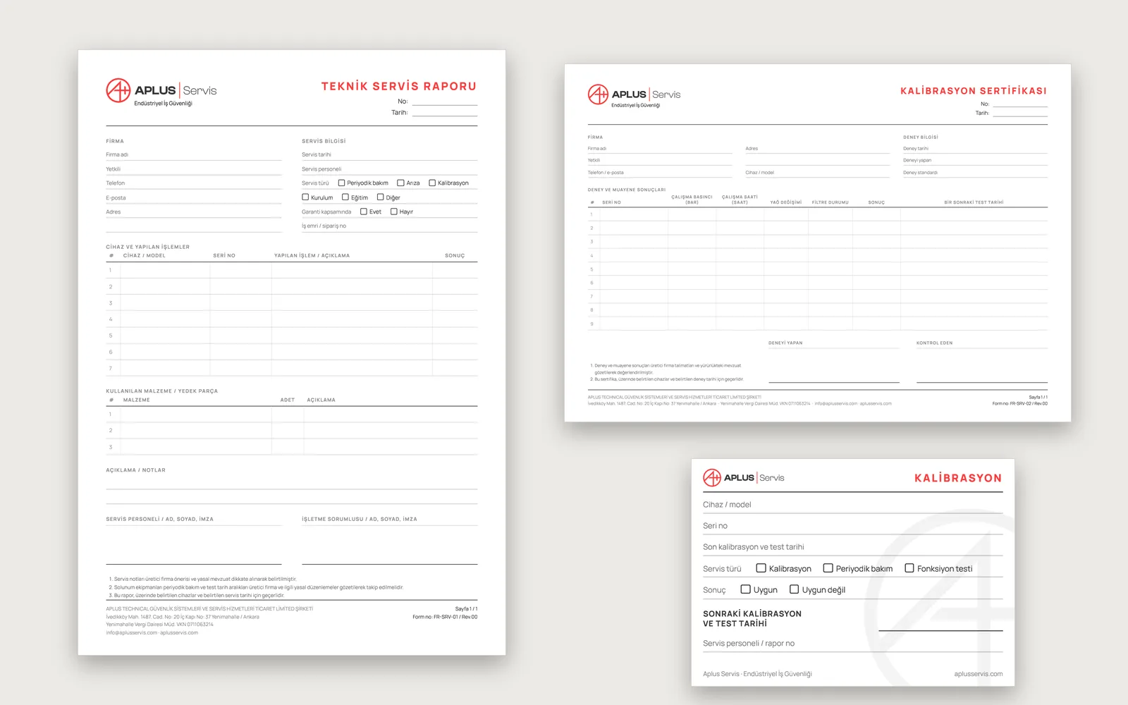
AaBbThe print set that carries the identity covers every piece that changes hands in the company's daily work:
The print-shop files were prepared as PDF-CMYK and EPS: text outlined, colors converted to CMYK, pages at net trim size. For the service report filled in on site, carbonless pad printing was recommended.
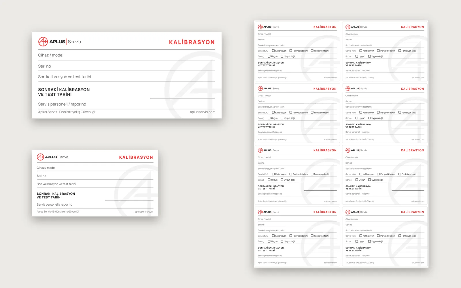
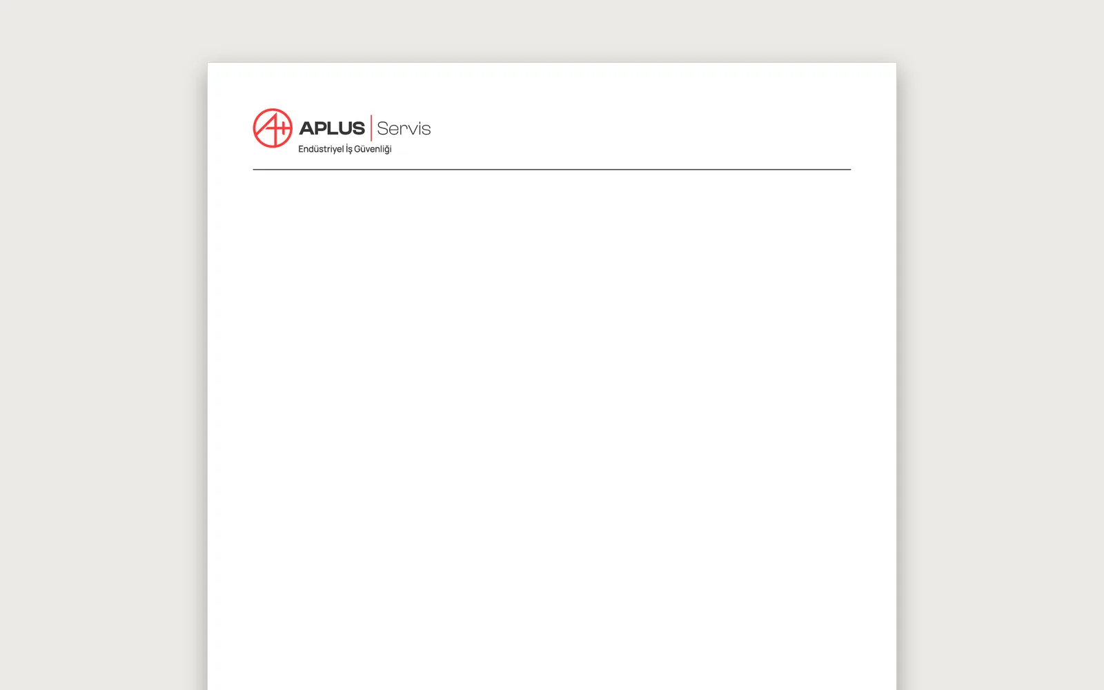
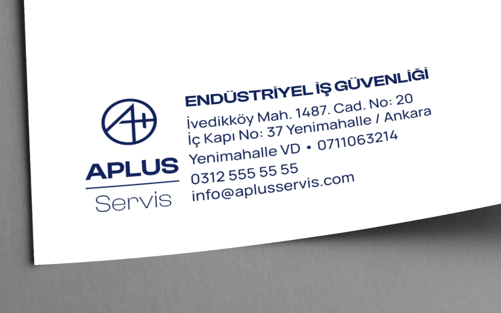
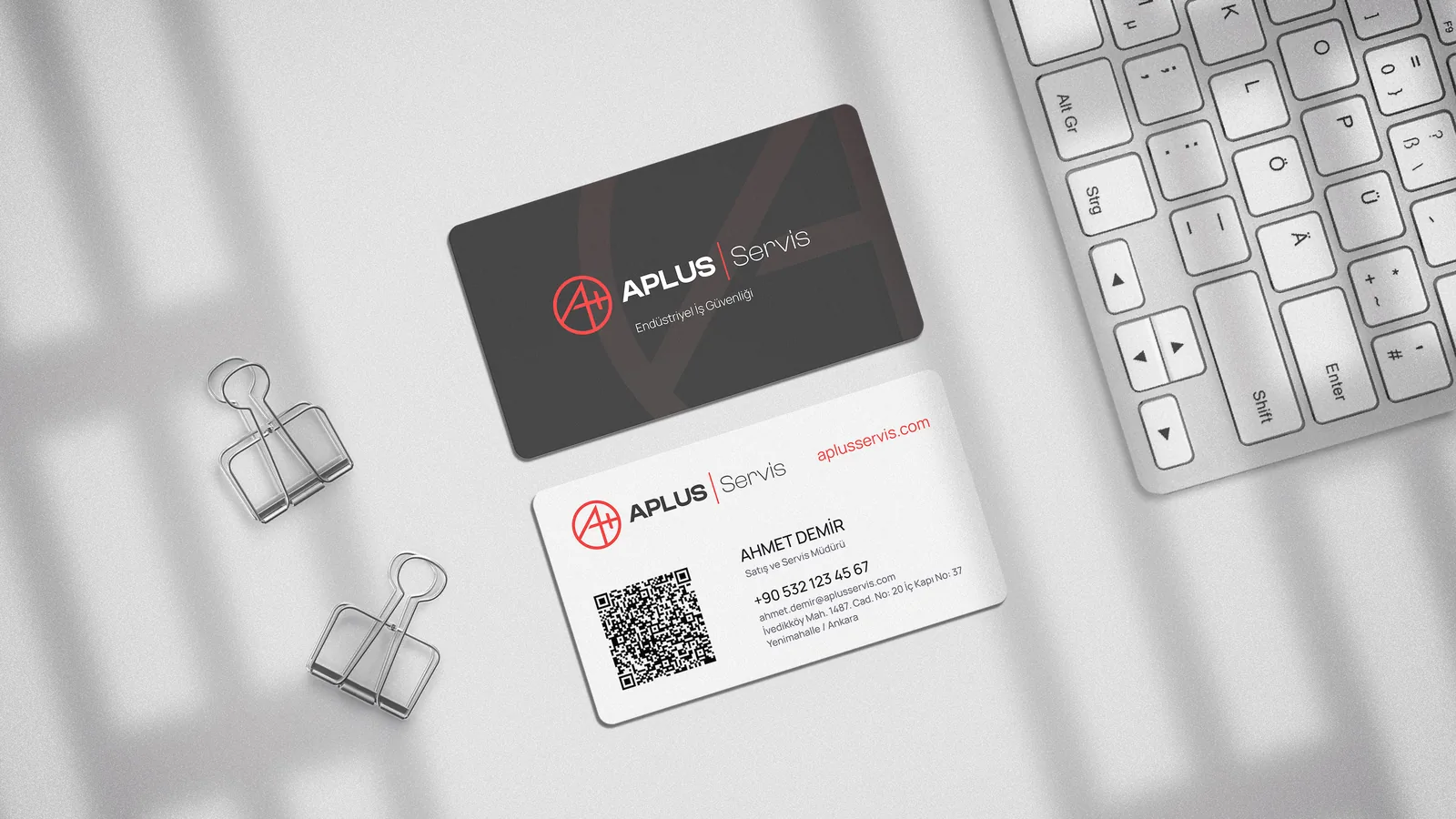
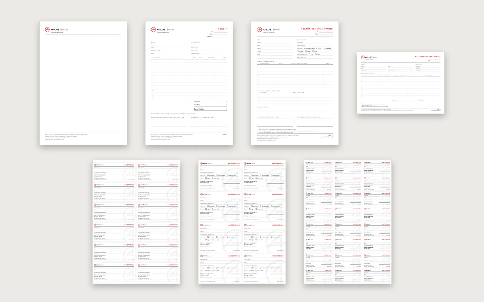
Not every form has to go to a print shop. We also delivered the same design as Word templates to be filled in on a computer and printed at the office, and as blank PDFs to be filled in by hand.
The blank PDFs can be printed on an office printer and filled in by hand. The same document can therefore be produced in three ways, and all three look the same.
Once the identity and the print set were complete, we designed, built and launched the Aplus Servis website. The structure rests on the fact that a service company's relationship with its customers runs on dates: breathing sets, cylinders and detectors have to be tested at set intervals. So the site explains when each job is due as much as what the job is.
The five service pages follow the same order: the scope of the service, the risk when it slips, how and when the work is done, and a call for a quote at the end. Whichever page a visitor lands on, the path to a quote is the same.
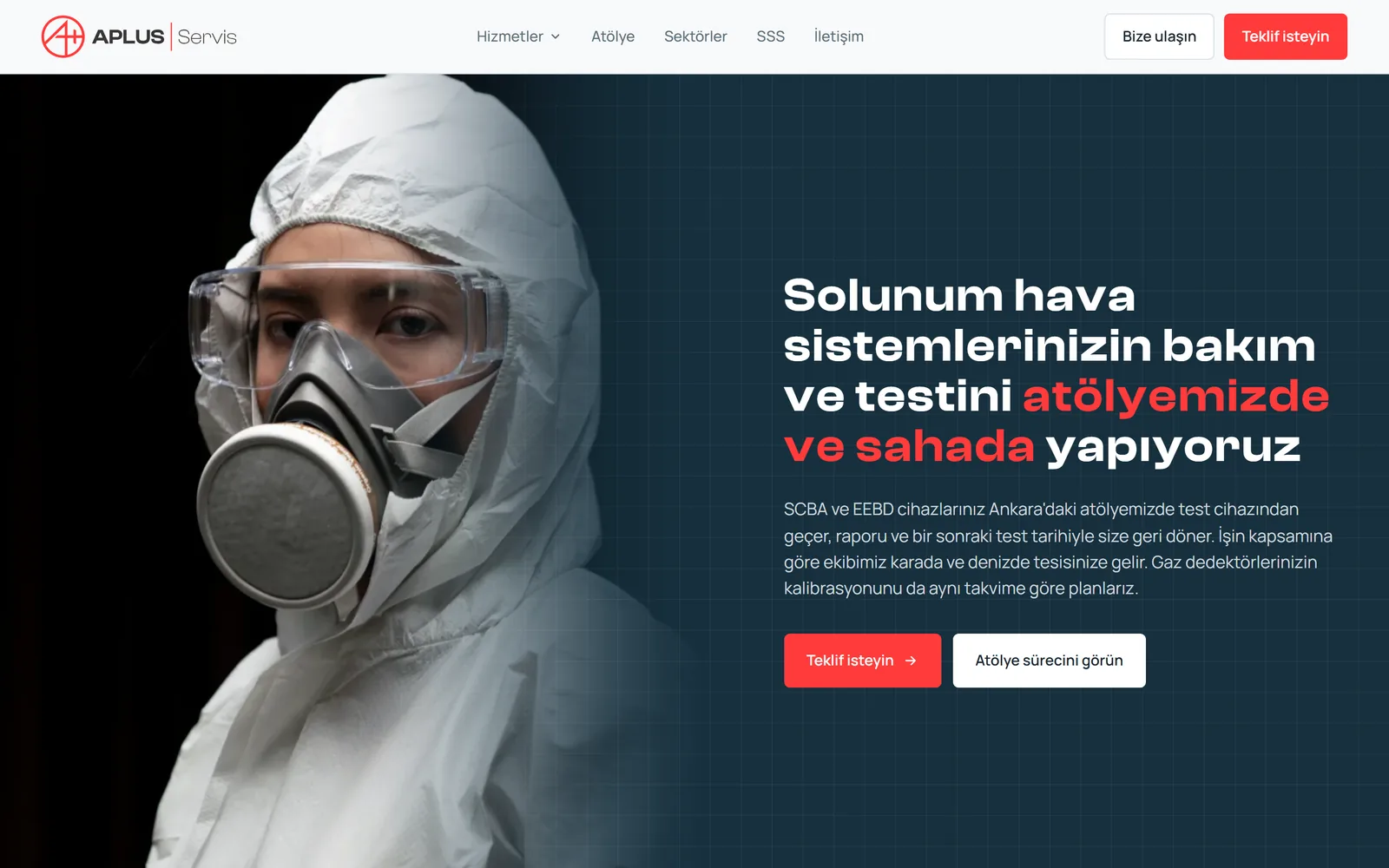
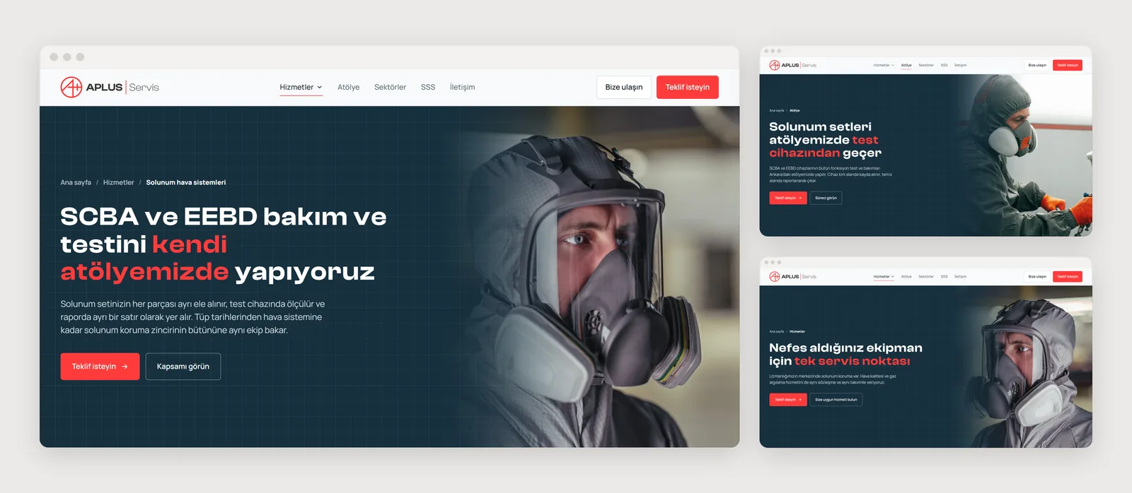
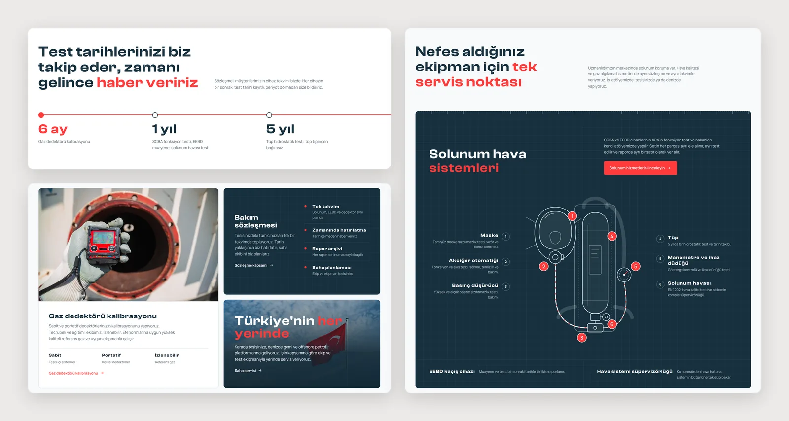
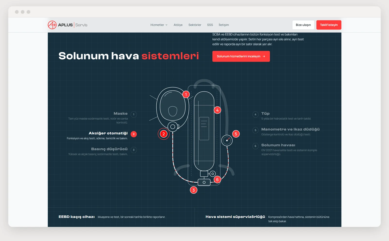
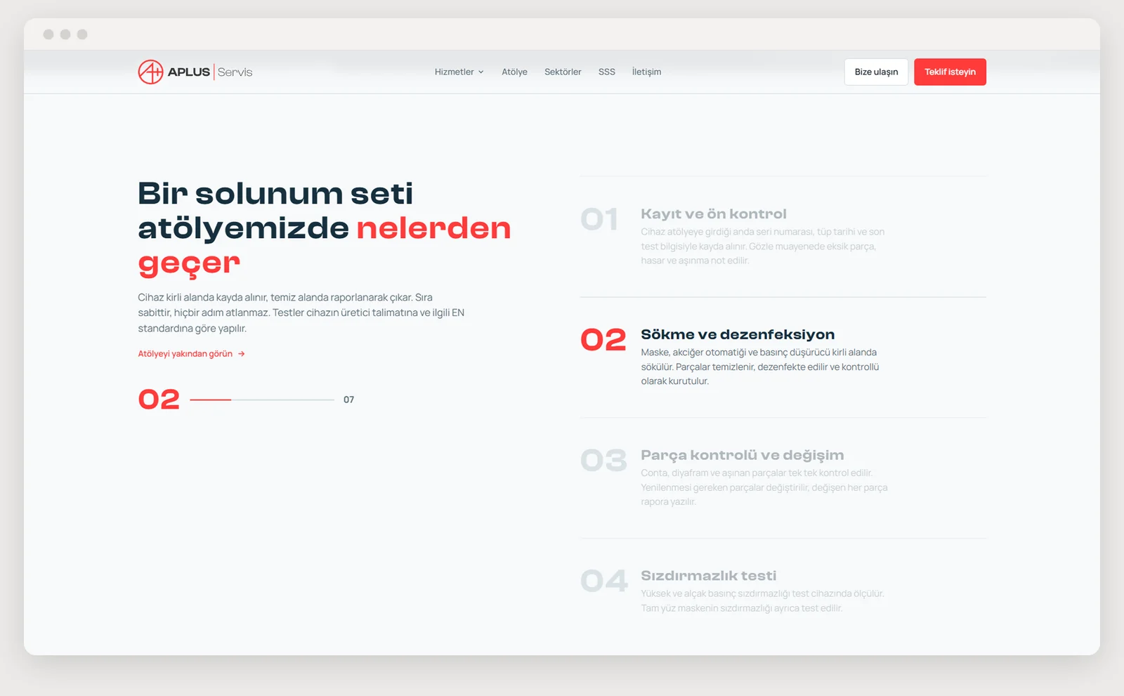
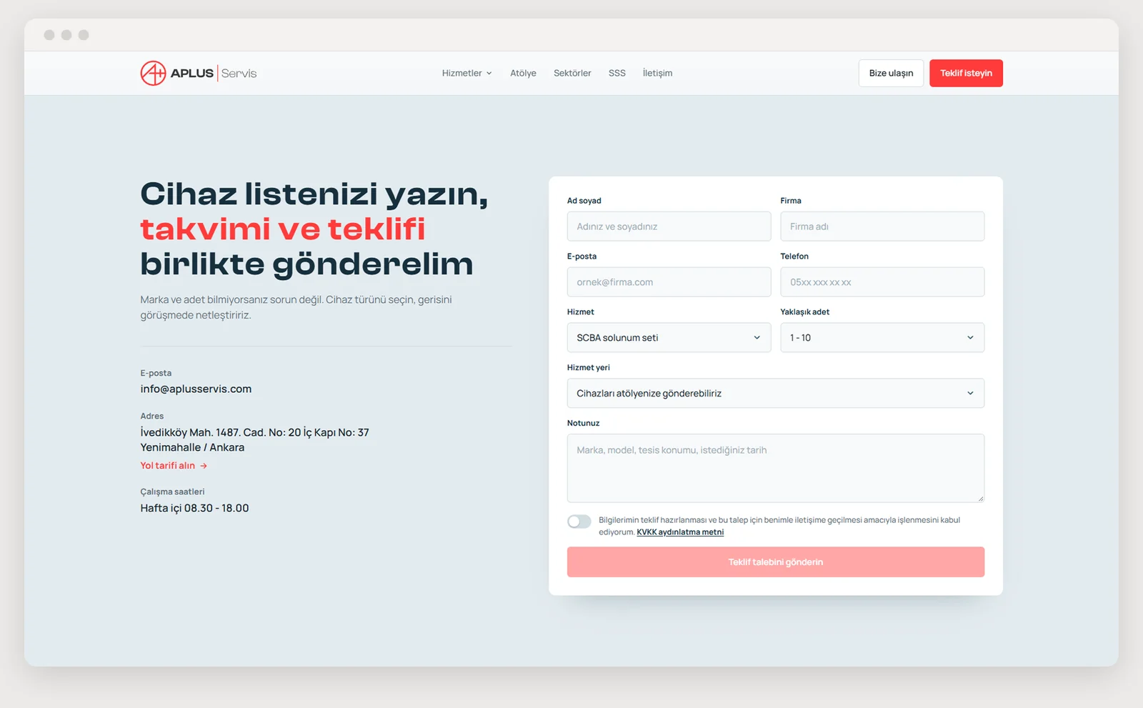
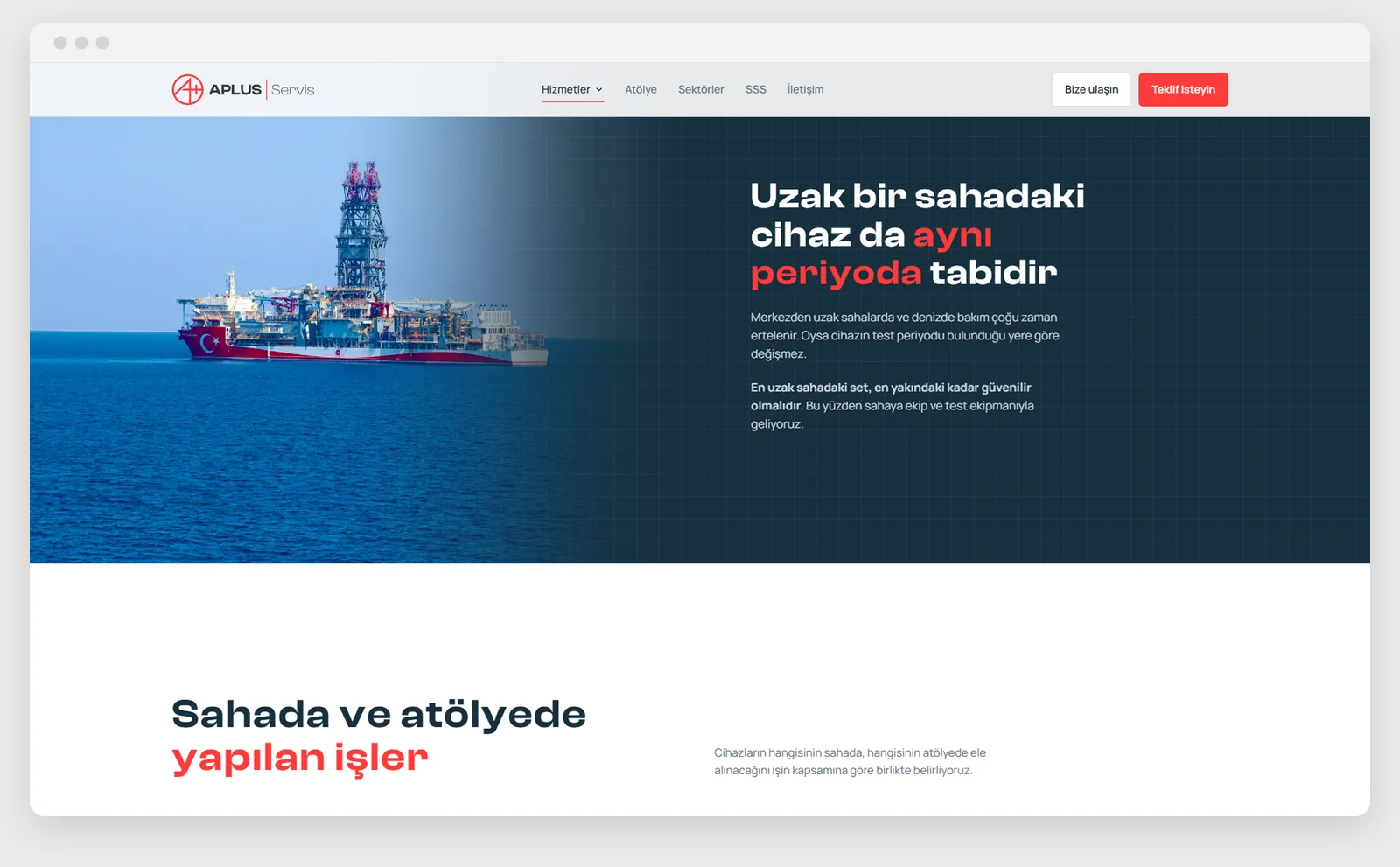
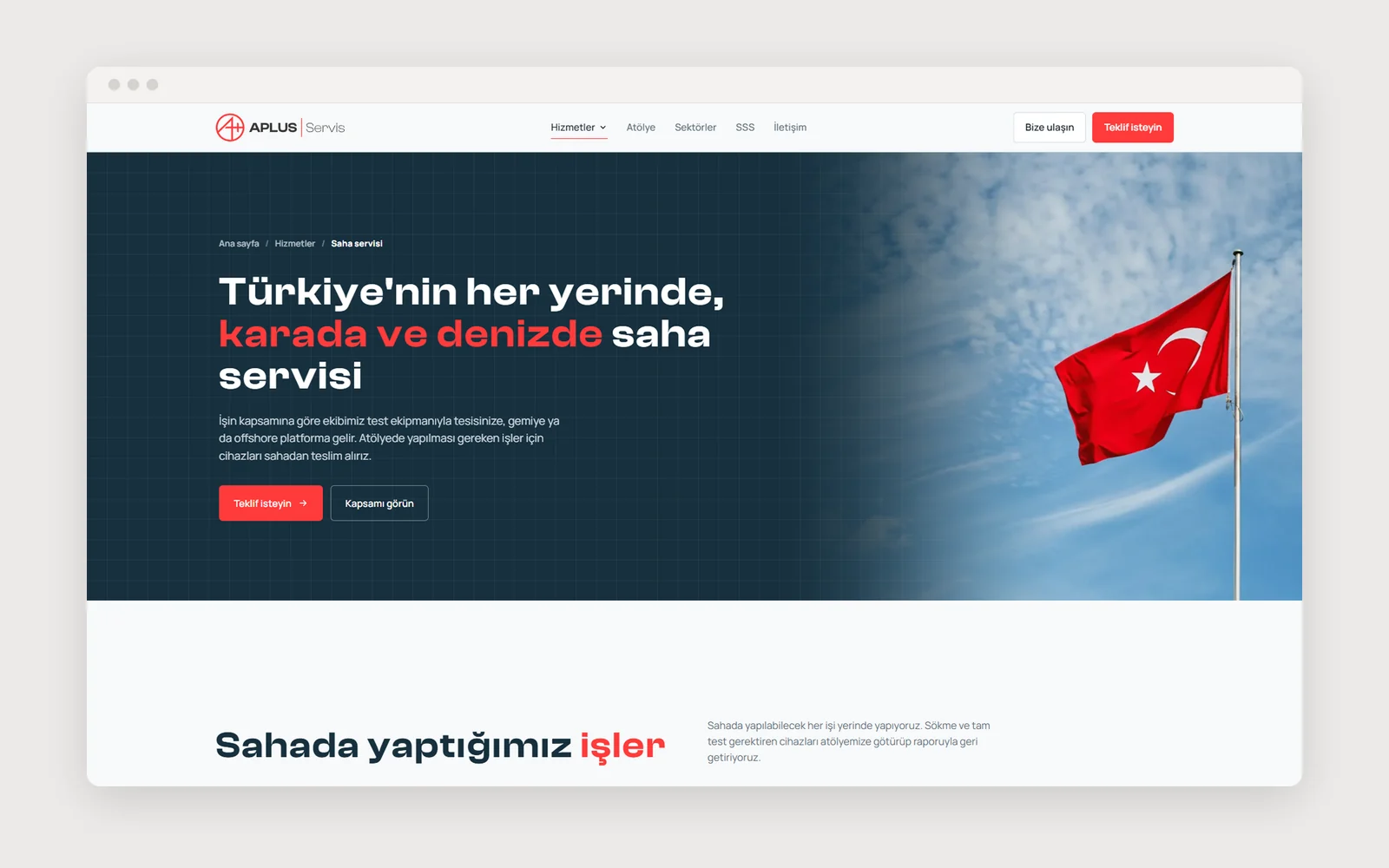
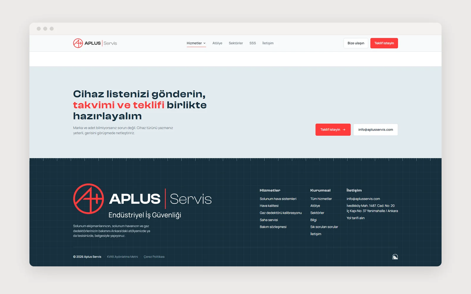
The site comes from the same identity as the print set. The red accent #FF3B3B carries over to the web, headings are set in Clash Display and running text in Manrope. The same brand reads on the business card, the service form and the web page.
The link extends to the documents as well. The technical service report filled in on site (FR-SRV-01) can also be prepared in a web tool built for the team, with the same identity. The service report now carries the same identity as a printed form, a Word template and a web tool.
On mobile, the logo and the quote button stay fixed in the top bar, and the sections drop to a single column on the phone screen.
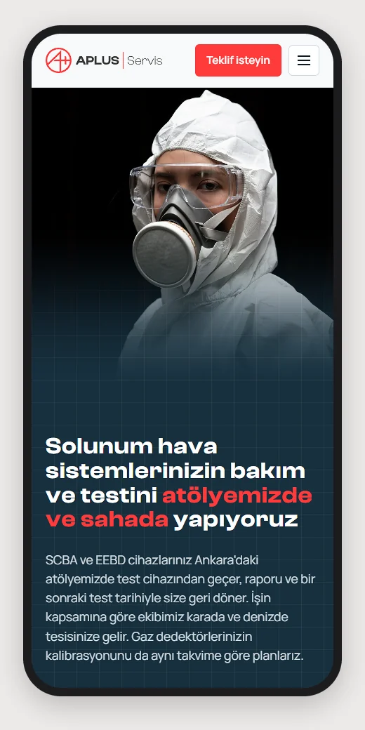
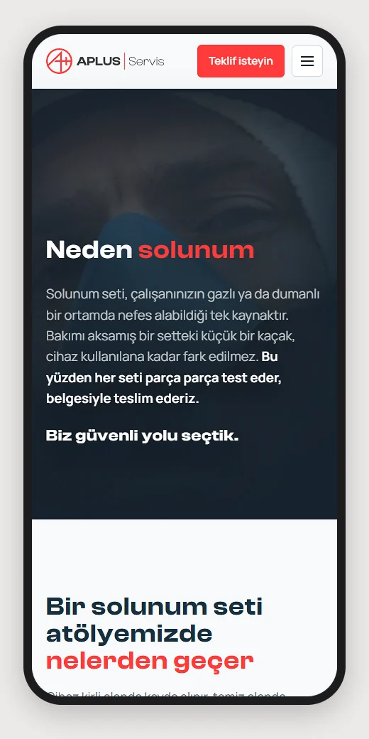
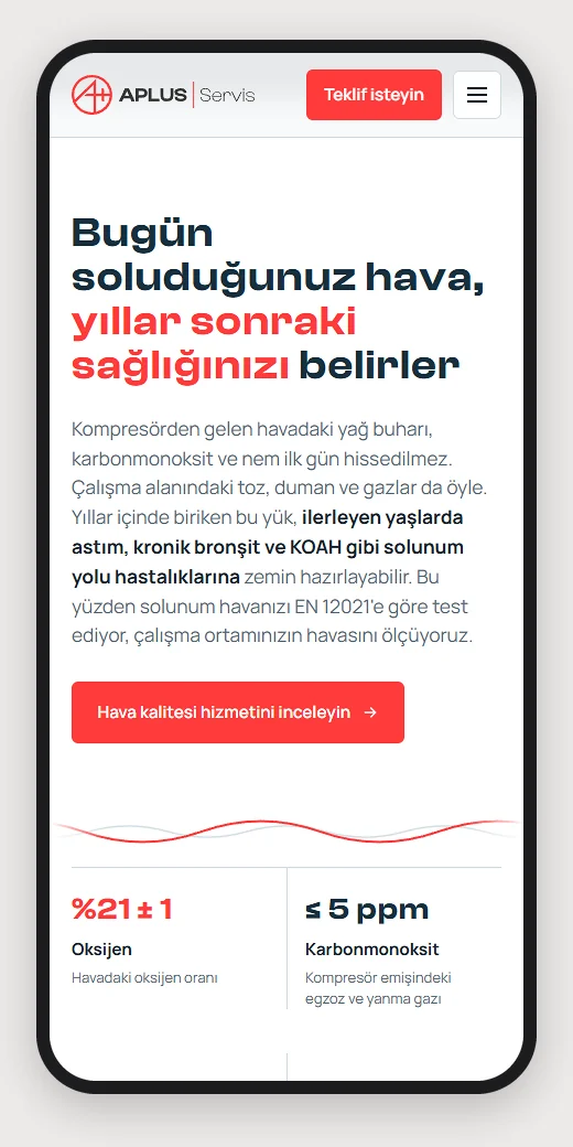
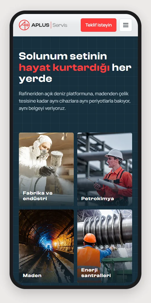
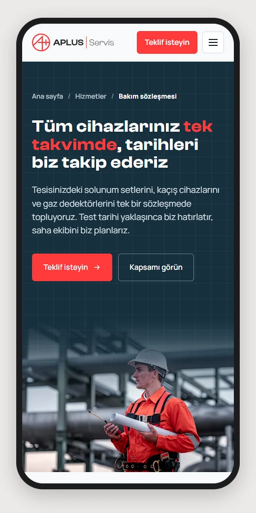
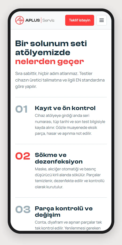
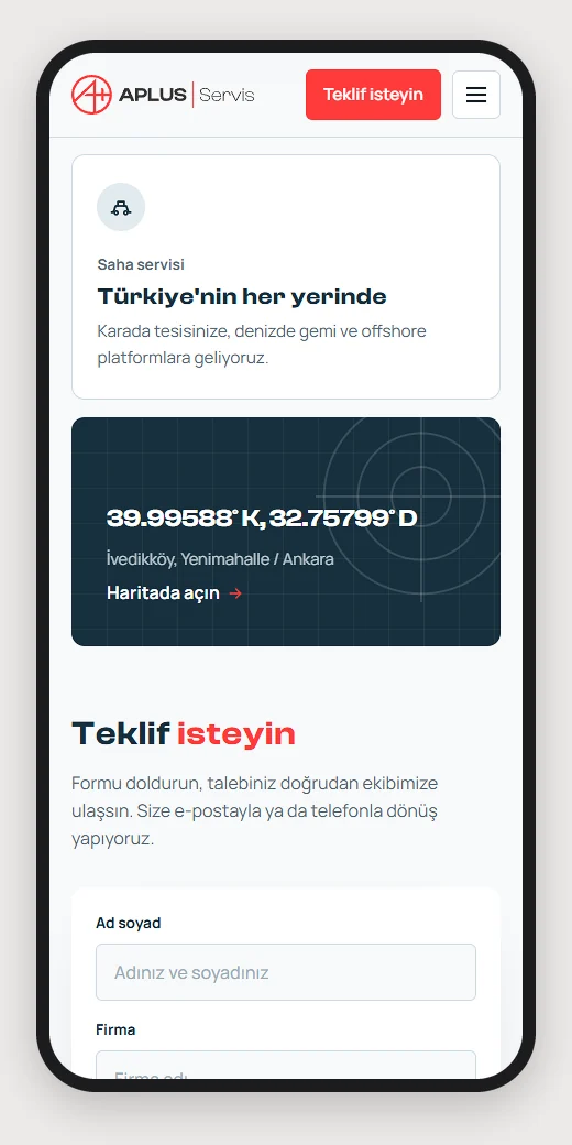
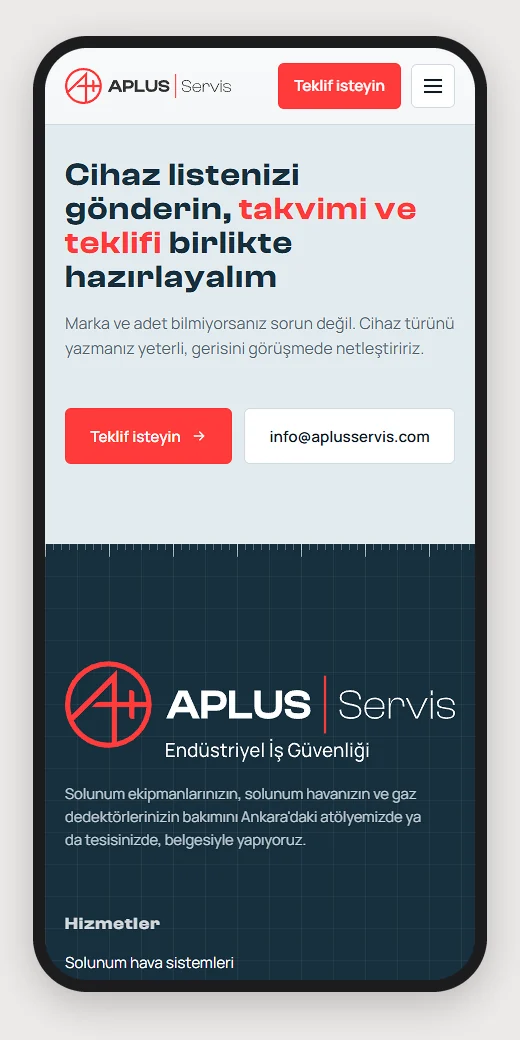
Aplus Servis now has its own logo, social media profile images, a document set ready for use in the field and a website that carries the same identity. The logo system was delivered in September 2026, the print set in early October 2026. The site is live at www.aplusservis.com.
Every document and page added from here on can be built on the same rules.